
What I found when I actually talked to people
Questions I asked
Two more assumptions didn’t survive contact with real users:
I assumed tiffin services already solved this for people who want to outsource the decision.
They confirmed the demand to outsource decisions, but not through this solution: people wanted to hand off the decision without losing control entirely.
People want to schedule exact delivery times
They didn’t. Precision wasn’t the ask. A dependable window beat a fixed slot every time
It's 1pm. You still haven't eaten. You open Swiggy with no plan and no idea what you want.
First Instinct
They forget → send a notification → problem solved.
What it actually was
They weren’t forgetting. They were avoiding it. A reminder doesn’t fix avoidance, it just becomes another thing to ignore.
My instinct going in: People forget to order, so a reminder fixes it. Send a notification, done. Except most people already had notifications on, and they still weren’t ordering. They weren’t forgetting. They were avoiding a decision they didn’t have the energy to make. A reminder just becomes one more thing to swipe away.
Where the friction was
No spending visibility
Daily ordering adds up quietly. Nobody had a clear picture of their weekly total.
Decision fatigue
Choosing from scratch every day is small but relentless. It compounds.
Chaos at scale
Planning five days manually means tracking five separate things
Multiple orders = chaos
Schedule five days manually and you have five separate things to track.
The core idea: move the decision to Sunday, when someone’s fed, relaxed, and actually has an opinion, instead of forcing it into the worst 15 minutes of their Tuesday.
The impact, quantified:
Daily ordering = 5 decisions × 5 days = 25 decisions a week. Lunchbox = 4 decisions, once. That’s a 84% reduction in the number of times a user has to actively decide something.
Building Inside the Swiggy Flow
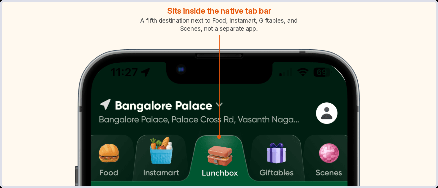
How I got there: the decisions that mattered, phase by phase
I’m highlighting three moments, because these are the calls that actually shaped the product, not just the screens that came out of them.
This is where the user decides to open Lunchbox at all, and what they see first.
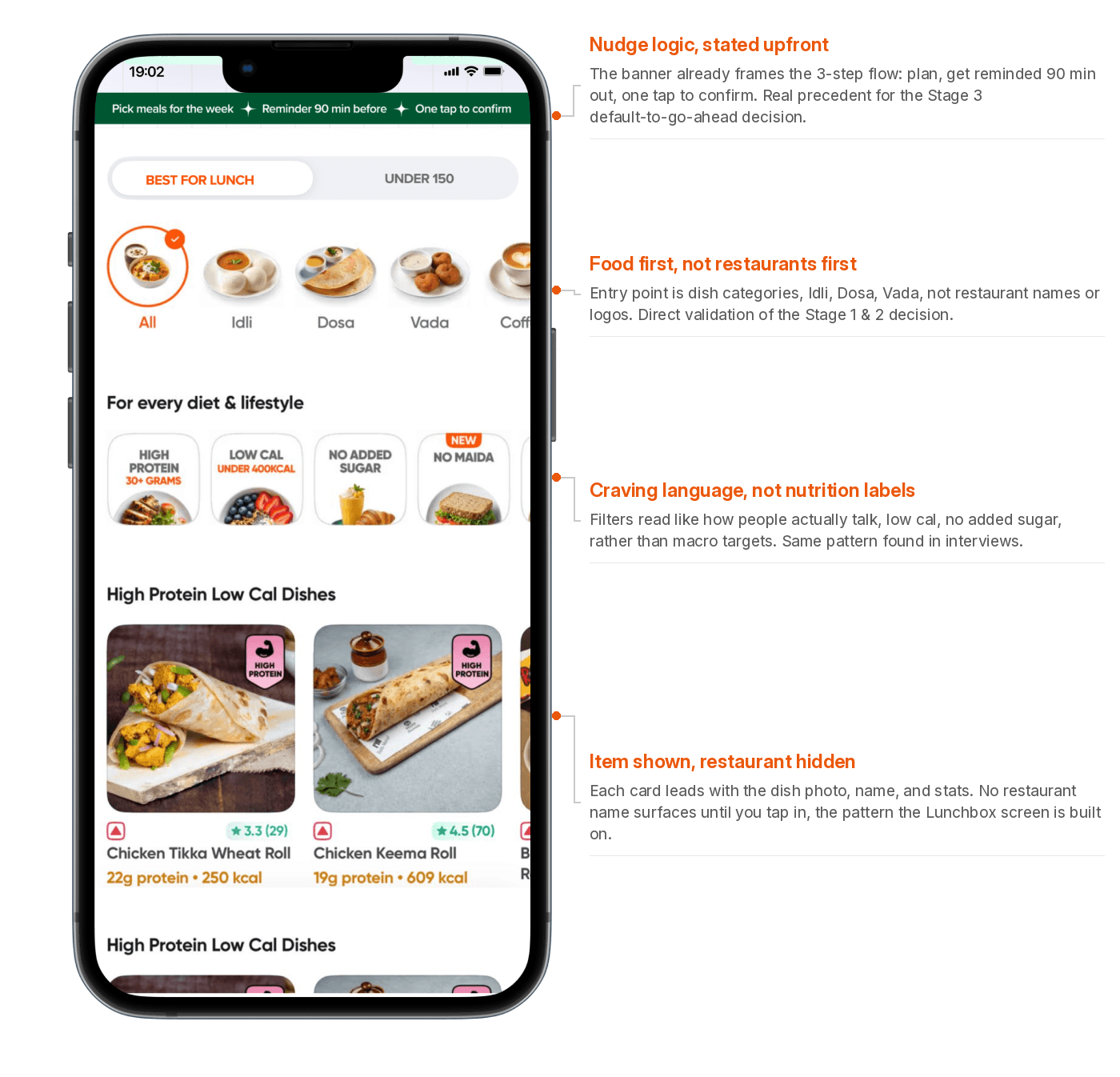
Pain point addressed: decision fatigue
The obvious flow asks “when do you want it” before “what do you want.” I built it that way first, and it felt wrong, like I was rearranging the problem, not solving it.
Talking to users confirmed why: nobody thinks in delivery slots. They think in cravings, “South Indian,” “something light,” “ghar ka khana vibes.”
Flipping the sequence to match how people actually think removed a “translate my feeling into a search term” step that didn’t need to exist. This is where the 25-decisions-to-4 compression actually starts.
The actual planning session. What, which days, what window.

The week lives on the home screen, not a settings menu
Scheduled meals sit right on the Lunchbox home screen, not tucked into a tracking tab. The reassurance is passive, you don’t go looking for confirmation your week is handled, it’s just there.
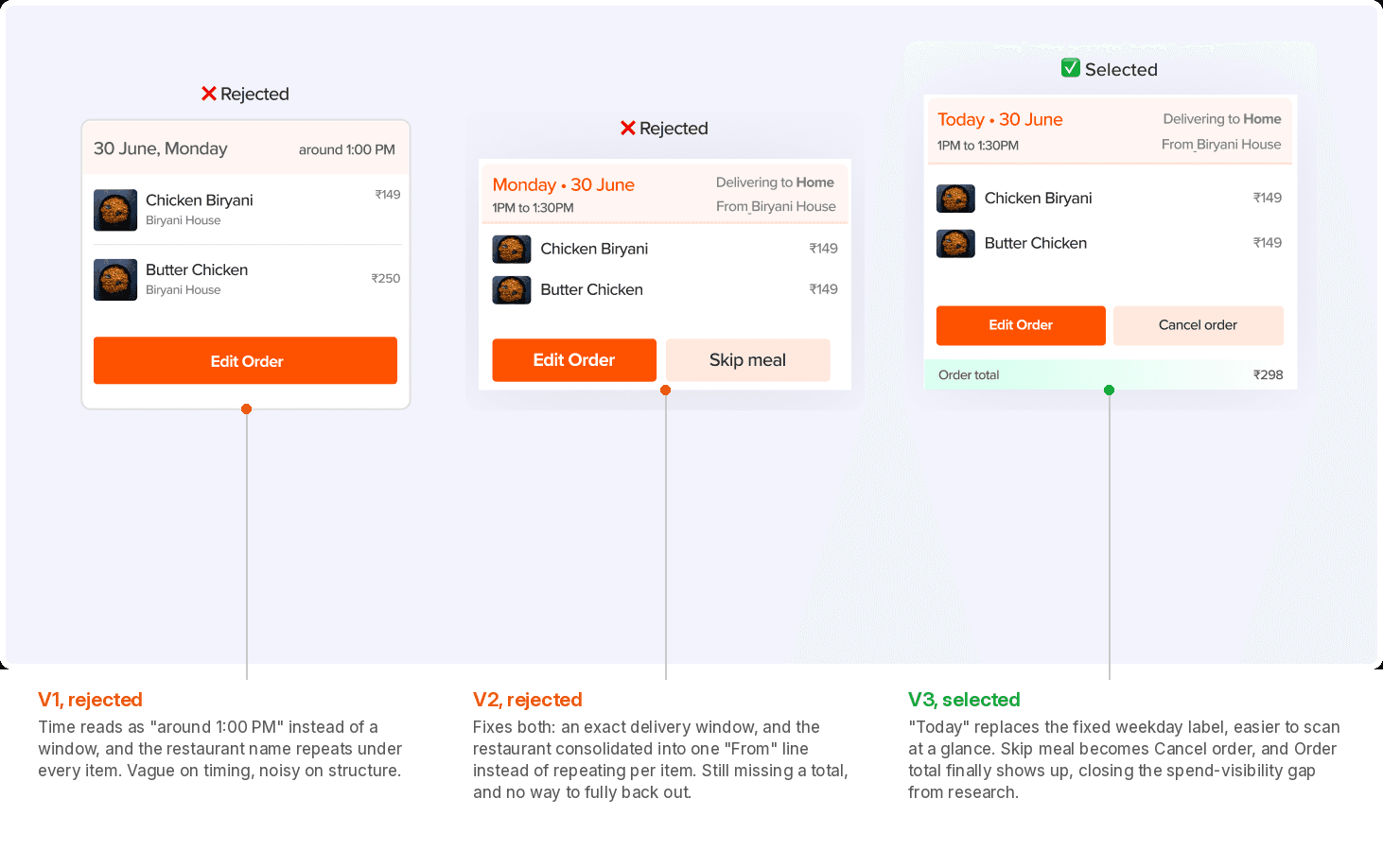
Pain point addressed: chaos at scale.
Users didn’t want precision, they wanted certainty. Giving them a delivery window instead of a fixed time traded a small amount of control for something people valued more: not having to think about it again. And instead of tracking five separate days as five separate things, one review screen shows the whole week before anything locks in, a last chance to catch a mistake, and a bit of relief that the week’s handled.
Scheduling ≠ order placed
Scheduling isn’t the same as placing an order:
My first version treated “Scheduled” as “Ordered.” Pick your meals on Sunday, and it shows up Monday no matter what. Then I thought about Tuesday: a last-minute team lunch comes up, and the biryani you scheduled three days ago is about to show up anyway regardless of what you actually need that day.

This is also where I had to answer for the thing I got wrong at the start: isn’t a 90-minute nudge just… another reminder? The difference is what it’s asking for.
The first reminder asked people to decide something, and decisions were the whole problem.
This nudge only asks them to undo something they already decided, when they have a reason to.
That’s a fundamentally lighter ask, and it’s why it works where the original idea didn’t.
The honest trade-off: this design bets on the notification landing right. Miss it, and an order shows up you didn’t want. I’d call this the single riskiest decision in the product, and I’d want to test it first if this shipped.
What I’d do next if this were real
Test first
Higher downside than food-first, a missed nudge means an unwanted order.
What I’d measure
Sunday completion rate, nudge skip/swap rate, week-over-week retention.
Least sure about
Default-to-go-ahead, it puts all the trust on one notification landing right.
What v2 solves
Edge cases the happy path skips, holidays, sick days, last-minute plans.