Go Back

Designing the UI for How Passengers Book Bus Travel & Pays

Designing an end-to-end booking flow, from route search to boarding

Duration

Duration

Dec 2025 - Jan 2026

Project

Project

Freelance commission

Team

Team

Atharv Damle
Anshul Sharma (Developer)

Project Background

This was a commission, not a direct client relationship. A senior brought me in to work on a bus ticketing product built for Ghana.

Market Context

Intercity travel in Ghana (Accra to Kumasi is the route used throughout the design) runs heavily on private coach operators rather than rail. Fares are in 'cedis', routes are named for real Ghanaian cities, and mobile money sits alongside cards as a payment method. The product had to feel native to that market, not like a generic booking template with local names swapped in.

Scope

Over 30 screens across two surfaces, covering everything from first search to booking a seat on the bus.

The Flow of Booking: How Someone Books a Seat

  1. Search: enter route and date

  2. Results: compare operators and fares

  3. Seat map: pick an actual seat

  4. Payment: pay by mobile money or card Confirmation: booking locked in
Flow 1: Home / Search

  1. Swap icon for quick route reversal (e.g. return trips)

  2. Single clear CTA: “Search buses”

  3. “Upcoming Journeys” section doubles as a dashboard for existing bookings

  4. Bottom nav keeps Home, Trips, Profile always accessible

Flow 2: Seat selection

  1. Results grouped by operator, not just time

  2. Each card shows: operator, seat type, rating, timings, starting fare

  3. Fare highlighted in green for fast price scanning

  4. Single next action per card (“View Seats”) to keep the funnel focused

The visual bus layout mirrors the real coach’s seat map (2+1 A/C Seater/Sleeper configuration), so users pick exactly what they’ll sit in, not an abstract seat number.

A colour-coded legend for available, selected, and booked seats removes ambiguity before committing, while a running fare total updates live as selections are made, keeping cost visible throughout the decision.

A single confirm CTA carries the user forward once seats are locked in.

Flow 1: Home / Search

Core booking fields upfront: From, To, Date, People.


  • Swap icon for quick route reversal (e.g. return trips)

  • Single clear CTA: “Search buses”

  • “Upcoming Journeys” section doubles as a dashboard for existing bookings

  • Bottom nav keeps Home, Trips, Profile always accessible

Flow 1: Home / Search

Core booking fields upfront: From, To, Date, People

  • Swap icon for quick route reversal (e.g. return trips)

  • Single clear CTA: “Search buses”

  • “Upcoming Journeys” section doubles as a dashboard for existing bookings

  • Bottom nav keeps Home, Trips, Profile always accessible

Flow 2: Seat Selection

Results grouped by operator, not just time

  • Each card shows: operator, seat type, rating, timings, starting fare

  • Fare highlighted in green for fast price scanning

  • Single next action per card (“View Seats”) to keep the funnel focused

The visual bus layout mirrors the real coach’s seat map (2+1 A/C Seater/Sleeper configuration), so users pick exactly what they’ll sit in, not an abstract seat number.

A colour-coded legend for available, selected, and booked seats removes ambiguity before committing, while a running fare total updates live as selections are made, keeping cost visible throughout the decision.

A single confirm CTA carries the user forward once seats are locked in.

The website

The desktop side

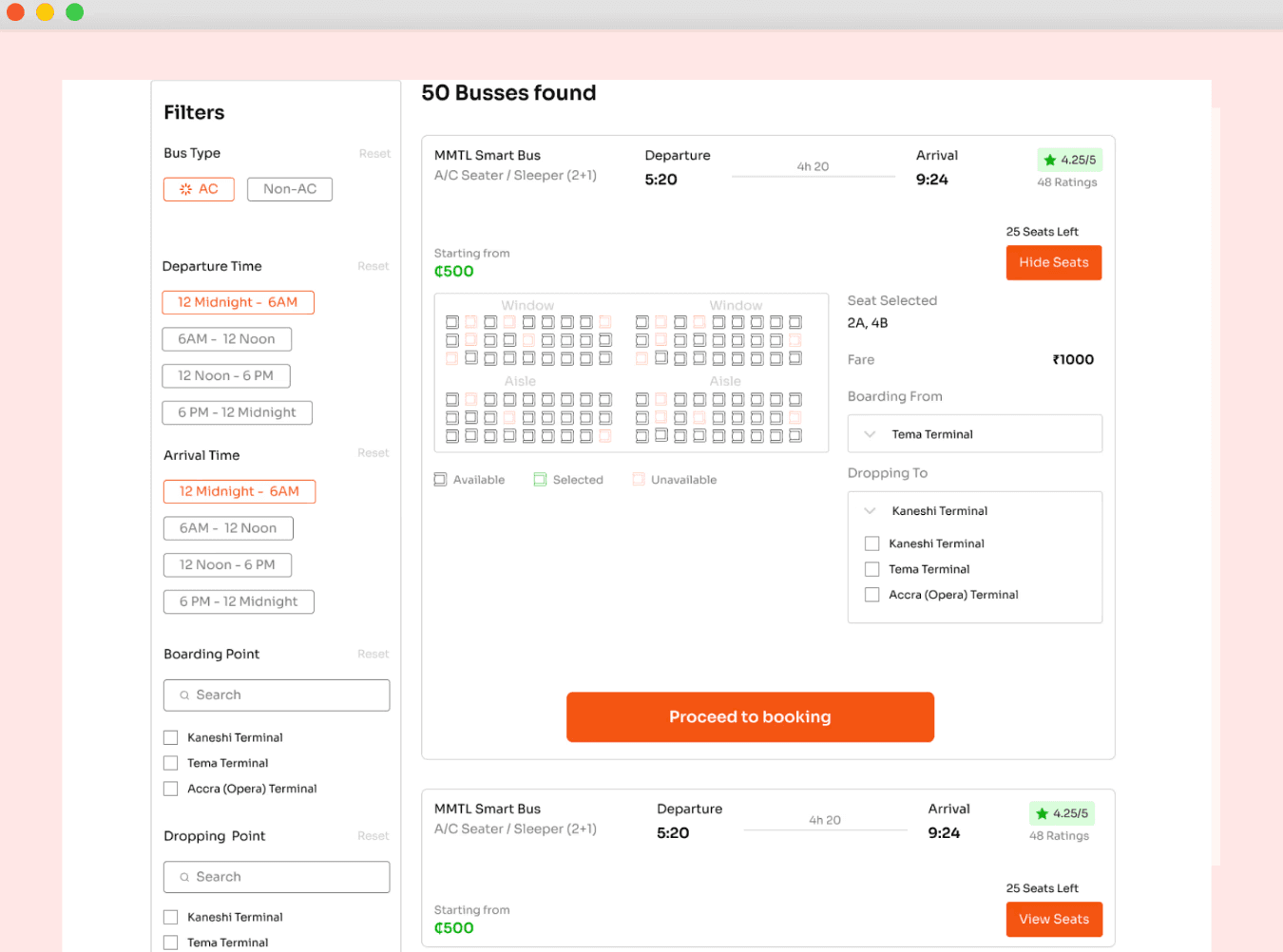
A separate “website” page in the file covers the same booking job for desktop, plus the marketing surface the app doesn’t need: a hero search, running promotions, an app-download push, and an FAQ.

A separate “website” page in the file covers the same booking job for desktop, plus the marketing surface the app doesn’t need: a hero search, running promotions, an app-download push, and an FAQ.

  • Card image
  • Card image
  • Card image

Decisions

Where the real thinking happened

Where the real thinking happened

Not what got built, but what got chosen, and what it cost.

Not what got built, but what got chosen, and what it cost.

Seat map, not a “how many seats” picker.

More screens, more state to manage, but seat choice is the one personal decision in the flow: window, aisle, next to who. Worth the extra build.

A full calendar step, not a date field.

Fares and seats shift by day. One extra tap buys a rider the ability to compare Friday against Saturday at a glance, instead of typing a guess.

App splits seat selection out; web folds it into the booking page.

Same job, different room to work with. Mobile needs the map to breathe on its own screen; desktop has space to show map, trip, and traveler details together without crowding.

Mobile money leads payment, not a card form.

MTN, Vodafone Cash, Airtel Money up front, because that’s how people in Ghana actually pay, not a card form with local options bolted on as an afterthought.

Seat map, not a “how many seats” picker.

More screens mean more state to manage, but seat choice is the one personal decision in the flow: window, aisle, or next to whom. Worth the extra build.

A full calendar step, not a date field.

Fares and seats shift by day. One extra tap buys a rider the ability to compare Friday against Saturday at a glance, instead of typing a guess.

App splits seat selection out; web folds it into the booking page.

Same job, different room to work with. Mobile needs the map to breathe on its own screen; desktop has space to show map, trip, and traveler details together without crowding.

Mobile money leads payment, not a card form.

MTN, Vodafone Cash, Airtel Money up front, because that’s how people in Ghana actually pay, not a card form with local options bolted on as an afterthought.

What it adds up to

A complete, ship-ready booking flow with no dead ends: someone can start by typing a departure city and end holding a scannable ticket, on either the app or the website. The two surfaces share the same underlying job: route search, date, seat, payment, ticket, even where the screens themselves diverge to fit the room each platform has to work with.

What I’d do differently

I’d unify the seat-selection pattern earlier instead of solving it twice. Right now the app and website versions arrive at the same idea independently rather than from one shared rule for “when do we show the map inline vs. give it its own screen.” Deciding that rule upfront, before designing either surface, would have made the two feel like one decision expressed twice, instead of two decisions that happen to agree.

I’d unify the seat-selection pattern earlier instead of solving it twice. Right now the app and website versions arrive at the same idea independently rather than from one shared rule for “when do we show the map inline vs. give it its own screen.” Deciding that rule upfront, before designing either surface, would have made the two feel like one decision expressed twice, instead of two decisions that happen to agree.

Thanks for rolling by :)